Map Types
The following map types are available in MapViewer.
 Base
maps contain boundaries without any data representation. Boundaries
can be polygons, polylines, and points. Base maps can be used with other
maps to show features such as roads, streams, city locations, boundaries
that have no data associated with them, and so on. You can overlay base
maps on other thematic maps by creating the base map on a separate MapViewer layer.
Base
maps contain boundaries without any data representation. Boundaries
can be polygons, polylines, and points. Base maps can be used with other
maps to show features such as roads, streams, city locations, boundaries
that have no data associated with them, and so on. You can overlay base
maps on other thematic maps by creating the base map on a separate MapViewer layer.
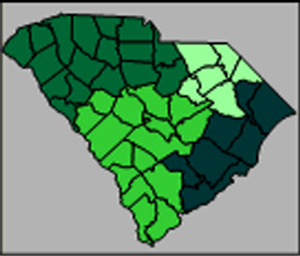
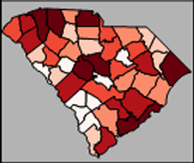 Hatch
maps use colors to represent classes of data for each polygon, polyline,
or point on the map. Hatch maps color code objects based on the data values
associated with them. Data values are placed in classes that are defined
by data ranges, and one color is associated with each class.
Hatch
maps use colors to represent classes of data for each polygon, polyline,
or point on the map. Hatch maps color code objects based on the data values
associated with them. Data values are placed in classes that are defined
by data ranges, and one color is associated with each class.
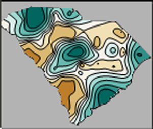 Contour
maps interpolate from discrete data values to create a regularly-spaced
grid. The grid is displayed as lines of constant data values. The areas
between the lines may be filled with colors and patterns of your choice.
Contour
maps interpolate from discrete data values to create a regularly-spaced
grid. The grid is displayed as lines of constant data values. The areas
between the lines may be filled with colors and patterns of your choice.
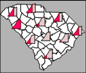
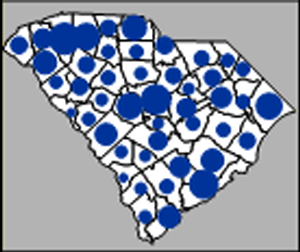 Symbol maps place a scaled
symbol on an area, curve, or point location on the map. The symbols are
scaled in proportion to the data values represented for each boundary
object. The larger the symbol, the greater the associated data value.
Symbol maps place a scaled
symbol on an area, curve, or point location on the map. The symbols are
scaled in proportion to the data values represented for each boundary
object. The larger the symbol, the greater the associated data value.
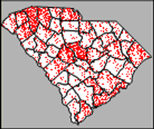 Density
maps, also called dot density maps, use symbols to represent data
values for areas on a map. On a density map, each symbol represents some
data value, so the number of symbols drawn in an area is in relation to
the data value associated with that area. Areas with more symbols have
higher associated data values.
Density
maps, also called dot density maps, use symbols to represent data
values for areas on a map. On a density map, each symbol represents some
data value, so the number of symbols drawn in an area is in relation to
the data value associated with that area. Areas with more symbols have
higher associated data values.
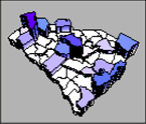
 Territory
maps allow areas, curves, or points to be grouped into territories
by defining a grid or by hand selecting the areas for territories. All
objects within a territory are displayed with the same color. Statistical
information about the objects’ associated data is available in the Info page of the Property
Manager
Territory
maps allow areas, curves, or points to be grouped into territories
by defining a grid or by hand selecting the areas for territories. All
objects within a territory are displayed with the same color. Statistical
information about the objects’ associated data is available in the Info page of the Property
Manager
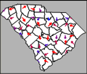 Vector
maps interpolate from discrete data values to create a regularly-spaced
grid. Vectors are drawn to show the direction and magnitude of the steepest
slopes across the grid.
Vector
maps interpolate from discrete data values to create a regularly-spaced
grid. Vectors are drawn to show the direction and magnitude of the steepest
slopes across the grid.
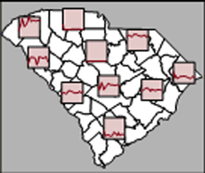
 Line
graph maps show line graphs of the data at each polygon, polyline,
or point location. By looking at a single line graph, you can see how
the individual data value relates to the whole data set. The Graph
fill color represents the data value.
Line
graph maps show line graphs of the data at each polygon, polyline,
or point location. By looking at a single line graph, you can see how
the individual data value relates to the whole data set. The Graph
fill color represents the data value.
 Multi
Graph maps display unique line graphs or scatter plots for objects
in a map. Each object has a unique XY data set. Multi-Graph data can be
related, so you can compare values in different locations.
Multi
Graph maps display unique line graphs or scatter plots for objects
in a map. Each object has a unique XY data set. Multi-Graph data can be
related, so you can compare values in different locations.
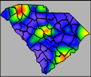 Gradient
maps display a range of colors based on information from points, curves,
and areas. The centroid of an area, all vertices of a curve, and center
of a point are used as data point locations and the data value of the
area, curve, or point is interpolated onto a grid. The gridded data values
are assigned colors based on the selected color spectrum. The resulting
map is a smooth color spectrum between the original data.
Gradient
maps display a range of colors based on information from points, curves,
and areas. The centroid of an area, all vertices of a curve, and center
of a point are used as data point locations and the data value of the
area, curve, or point is interpolated onto a grid. The gridded data values
are assigned colors based on the selected color spectrum. The resulting
map is a smooth color spectrum between the original data.
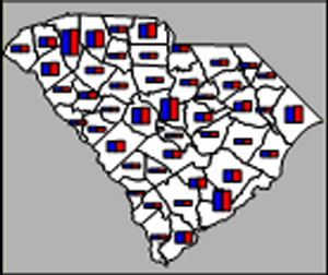 Bar
maps can be drawn for areas, curves, or points, and are a way to represent
several data values. Bar charts can show one or more variables where each
variable is represented by a proportionally sized bar.
Bar
maps can be drawn for areas, curves, or points, and are a way to represent
several data values. Bar charts can show one or more variables where each
variable is represented by a proportionally sized bar.
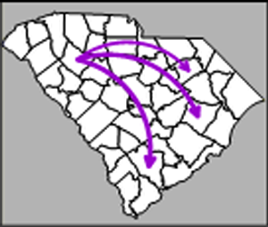 Flow
maps scale the width of existing curves on the map or connect the
centroids of boundary objects based on starting and ending locations.
The curves are scaled in proportion to the data values represented for
each curve. The wider the curve, the greater the data value associated
with the curve.
Flow
maps scale the width of existing curves on the map or connect the
centroids of boundary objects based on starting and ending locations.
The curves are scaled in proportion to the data values represented for
each curve. The wider the curve, the greater the data value associated
with the curve.
 Prism
maps draw each area, curve, or point as a raised prism, where the
height of the prism is relative to the associated data value. Taller prisms
indicate higher data values. Prism maps can be colored using the base
map color, with interpolated color between minimum and maximum colors,
or based on variable classification.
Prism
maps draw each area, curve, or point as a raised prism, where the
height of the prism is relative to the associated data value. Taller prisms
indicate higher data values. Prism maps can be colored using the base
map color, with interpolated color between minimum and maximum colors,
or based on variable classification.
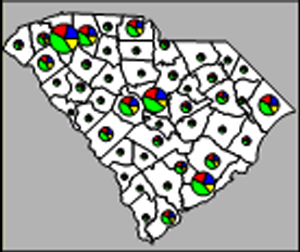 Pie
maps can be drawn for areas, curves, or points, and are a way to represent
several data values by drawing a proportionally sized pie chart for each
location. Pie charts show two or more variables where each variable is
represented by a proportionally sized slice of the pie. Within a single
pie, the size of the slices gives you the relative proportion of the values
for that particular area, curve, or point. The entire pie chart is sized
in relation to the total of all variables for the boundary object, as
compared to the totals of the variables for other boundary objects.
Pie
maps can be drawn for areas, curves, or points, and are a way to represent
several data values by drawing a proportionally sized pie chart for each
location. Pie charts show two or more variables where each variable is
represented by a proportionally sized slice of the pie. Within a single
pie, the size of the slices gives you the relative proportion of the values
for that particular area, curve, or point. The entire pie chart is sized
in relation to the total of all variables for the boundary object, as
compared to the totals of the variables for other boundary objects.
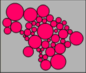 Cartogram maps display variables by varying area size. MapViewer's
cartograms are Dorling cartograms. The areas are replaced by circles and
the circles are scaled according to a variable. The maps can be controlled
so that the circles do not overlap and are positioned as close to the
base map's centroids as possible.
Cartogram maps display variables by varying area size. MapViewer's
cartograms are Dorling cartograms. The areas are replaced by circles and
the circles are scaled according to a variable. The maps can be controlled
so that the circles do not overlap and are positioned as close to the
base map's centroids as possible.
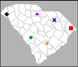 Pin
maps draw points at particular locations on a map. Pin maps can be
used to show locations, post labels, or display data values. Pin map point
locations are based on XY locations, such as longitude/latitude or US
5-digit ZIP code or US City and State centroids. Pin maps can also use
colors and symbols to represent data ranges or classes of data. Pin maps
color code or symbol code locations based on the data value associated
with pins. In addition, pin maps can be converted to other thematic maps
such as symbol maps, pie maps, or bar maps.
Pin
maps draw points at particular locations on a map. Pin maps can be
used to show locations, post labels, or display data values. Pin map point
locations are based on XY locations, such as longitude/latitude or US
5-digit ZIP code or US City and State centroids. Pin maps can also use
colors and symbols to represent data ranges or classes of data. Pin maps
color code or symbol code locations based on the data value associated
with pins. In addition, pin maps can be converted to other thematic maps
such as symbol maps, pie maps, or bar maps.
See Also
Creating Custom Boundaries
Linking
Data to Boundaries - The Primary ID
Creating
and Editing Thematic Maps
MapViewer Boundaries
MapViewer
Data
What is a
Thematic Map?